

TIMELY: Time Tracking App Assignment
Hello Zia and Brian (and anyone else from Axiom Zen), welcome to my take home assignment.
When I received the assignment, I had two, somewhat intertwined questions: Who is the target audience for the assignment (i.e., developer, founder, venture capitalists, etc.) and to what fidelity should the deliverables be? Brian gave me the direction that this assignment was meant to simulate pitching VCs for funding. He also suggested that I select the fidelity that suited my skill set. With that in mind, I opted to build two types of deliverables:
- a pair of mid-fidelity prototypes, to show off the most interest parts of the product as well as where it differentiates itself with competitors, and
- some high-fidelity mockups to help ground VCs in what this product could become.
High-fidelity Mockups
The reason I wanted to start with mockups is that it helps ground the audience in what the app could be so that they keep it in mind while reviewing lower-fidelity prototypes, wireframes, sketches, etc. I wanted to be more playful and bold with the interface design to really help hit home that the lower fidelity prototype really can be taken in a different direction.
Freelancer Dashboard
Client Detail Screen
Mid-fidelity Prototypes
Next I wanted to demonstrate a couple flows. The first is meant to show how TIMELY matches the offering its competitors have come to market with. The second is to show two pivotal differentiators:
- Invoicing and payment built in one app ecosystem, which solves the logistical issues surrounding moving from between your tracking/invoicing application and email.
- A companion client app (or mode, similar to Airbnb's Travel/Host modes), which allows clients and freelancers to have all invoicing, change request, and payment conversations to happen all within one context. There's also the added benefit for freelancers to remind clients of overdue invoices with notifications (a little more subtle than an email or phone call).
I decided to focus on the existing user for both the freelancer and client apps. Although, the new user onboarding experience is extremely important, for the purposes of attaining VC approval, showing the full experience with real data made more sense.
Client Reminder & Payment Invoice Flow
Project to Task to Invoice Flow
Results
In the emails from Zia and Brian, I was asked to answer a few questions:
1. How long did the assignment take?
20 hours. To break down how I spent those hours, see My Process in the appendix.
2. Did you learn anything new in the process?
I really wanted to show you my breadth of skill over this assignment and the only way to do that was to go through the entire project. This assignment gave me the opportunity to learn how to go through the process more quickly that I normally would have.
I also wanted to try out a new technique I'd read about recently: writing the interface. More on that in the User Flows & Writing out the Interface in the appendix.
Lastly, I've only ever used the competitive analysis visualization to map out larger areas that a business can explore, never specific features. As I was working it just seemed like a great way to convey the insight. Take a look at the visualization in the Competitive & Comparative Research in the appendix.
3. What was the hardest part?
Understanding the relationship between "tasks", "projects", and "invoices". I had originally gone down a path of a time tracker is attached to a task which becomes an invoice. This seemed to work well until I started prototyping out the flow. It quickly became apparent that something was missing… projects.
4. If you could go back and give yourself advice at the beginning of the project, what would it be?
Spend more time understanding the flow of task to invoice.
5. What is its key differentiator?
The fact that invoices and payment are all contained within one app ecosystem. It gets rid of the ambiguity and hassle of exiting the app to send an invoice via email and the issues that come with. As the user research and competitive analysis showed, this is an area that's a major pain point for users and one that other products don't address.
Thank you!
It was a great experience putting this project together. Thanks for giving me the opportunity and please reach out if you have any questions!
Cheers!
Sean
Appendix: My Process
User Research
Time: 1 hour
I had a few conversations with some freelancers (a designer, a developer, and a photographer) to ask them where and how they used apps for time tracking/invoicing/payment, their workflow, what they found useful, and where their pain points were. Three of my biggest insights from those conversations were:
- Many apps are fantastic at tracking a freelancer's time and invoicing clients, but all suffered from the same issue: once the invoice is created, it still needs to be taken out of the app and sent to the client via another medium (mostly email).
- Once the invoice was in the client's hands, the freelancer then lost sight of what was going on. Had the client reviewed an invoice? Were they going to pay it on time? If they don't, how long do I wait to remind them? (not to mention feeling embarrassment at having to remind them)
- Once the client paid an invoice, there was an inefficient bookkeeping effort to return to the invoicing app and update the invoice as being paid.
Competitive & Comparative Research
Time: 2.5 hours
For this portion of research, I reviewed a number of competitors who offered inexpensive (or free) mobile apps. The ones I spent the most time reviewing were Billings Pro, Zoho, Hours Time Tracking, and Toggl. I spent the majority of my efforts reviewing their mobile implementations, but also reviewed desktop/web experiences where applicable. The areas I was most interested in were their information architecture, how users moved between different modes (time tracking, invoicing, payment), and interesting UI patterns.
I moved onto visualizing how well competitors were meeting user needs and where they were falling down; I was looking for the white space in the graph that would help TIMELY differentiate itself from the rest.
My initial findings from user research were confirmed: there were gaps between invoicing and payment and there was a lot of unknowns once the invoice was sent to the client.
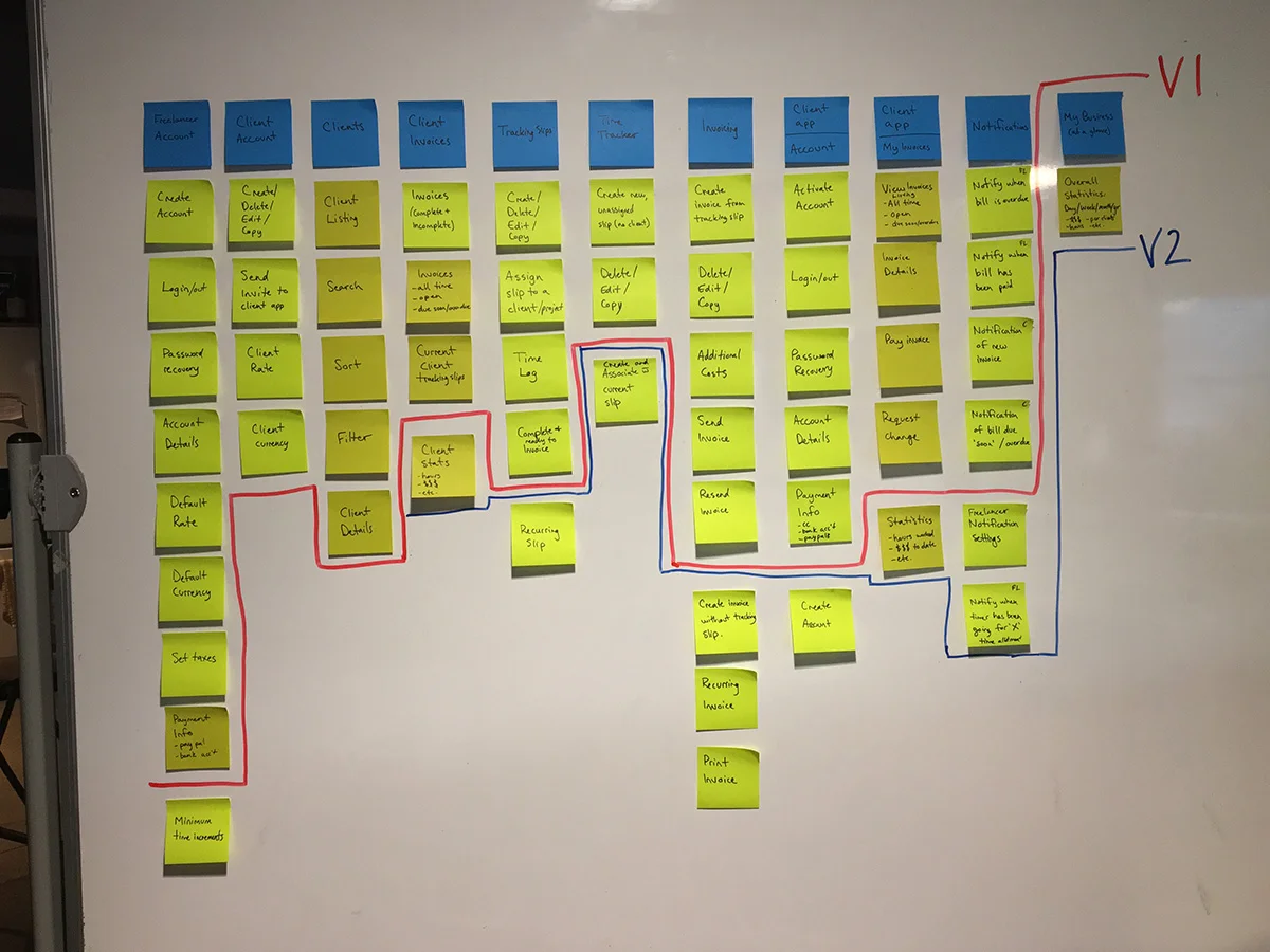
Story Mapping the Experience
Time: 1 hour
Before moving onto design, I decided to create a storymap for the app. I've come to love the simplicity and efficiency of storymaps. Within a very short timeframe, you can get a grasp on the scope of a project, find holes in your understanding, and get an idea of the amount of effort required. You can also draw a line of what the MVE (minimum viable experience) could be. The storymap is also an excellent place to start ideating on new ideas or features. Lastly, from a product management point of view, the story map becomes the starting point for epics and feature backlog.


User Flows & Writing out the Interface
Time: 2.5 hours
I used the storymap to construct user flows for both the freelancer and client apps. From there I moved onto "writing out the interface", a technique I took from Jef Raskin (author of The Humane Interface and founder of the Macintosh project at Apple). The idea is that you review each interface you need to design and write out exactly what you'll find there. This allows you to focus on what's most important in the interface, not on layout or typography. To see the deliverable, download it from my TIMELY documents Dropbox folder.
Sketching & Pattern Research
Time: 2 hours
Now that I understood what each interface contained, I started sketching. To supplement this portion of the design phase, I also spent some time reviewing design pattern online for inspiration.


Wireframing & Prototyping
Time: 8 hours
This portion took a little longer than expected because I was hopping back and forth between sketching. I had originally been hoping to keep things simple: a freelancer works on a task and that task becomes their invoice. As I worked through the problem (and especially as I started some initial prototyping) it became apparent that tasks really needed to be groups into projects, which then became invoices.
I've gone through the effort to string together as much of the interface as possible in this full prototype. For a more guided prototype experience, please review the two prototypes above.
Full Prototype
Art Direction
Time: 3 hours
When I started this project, I opted to concentrate on the user experience design and only design a couple screens. In my usual design process, I'd go down quite a few different paths using web style boards before before settling on one direction and designing detailed interfaces.